Decentralized exchange
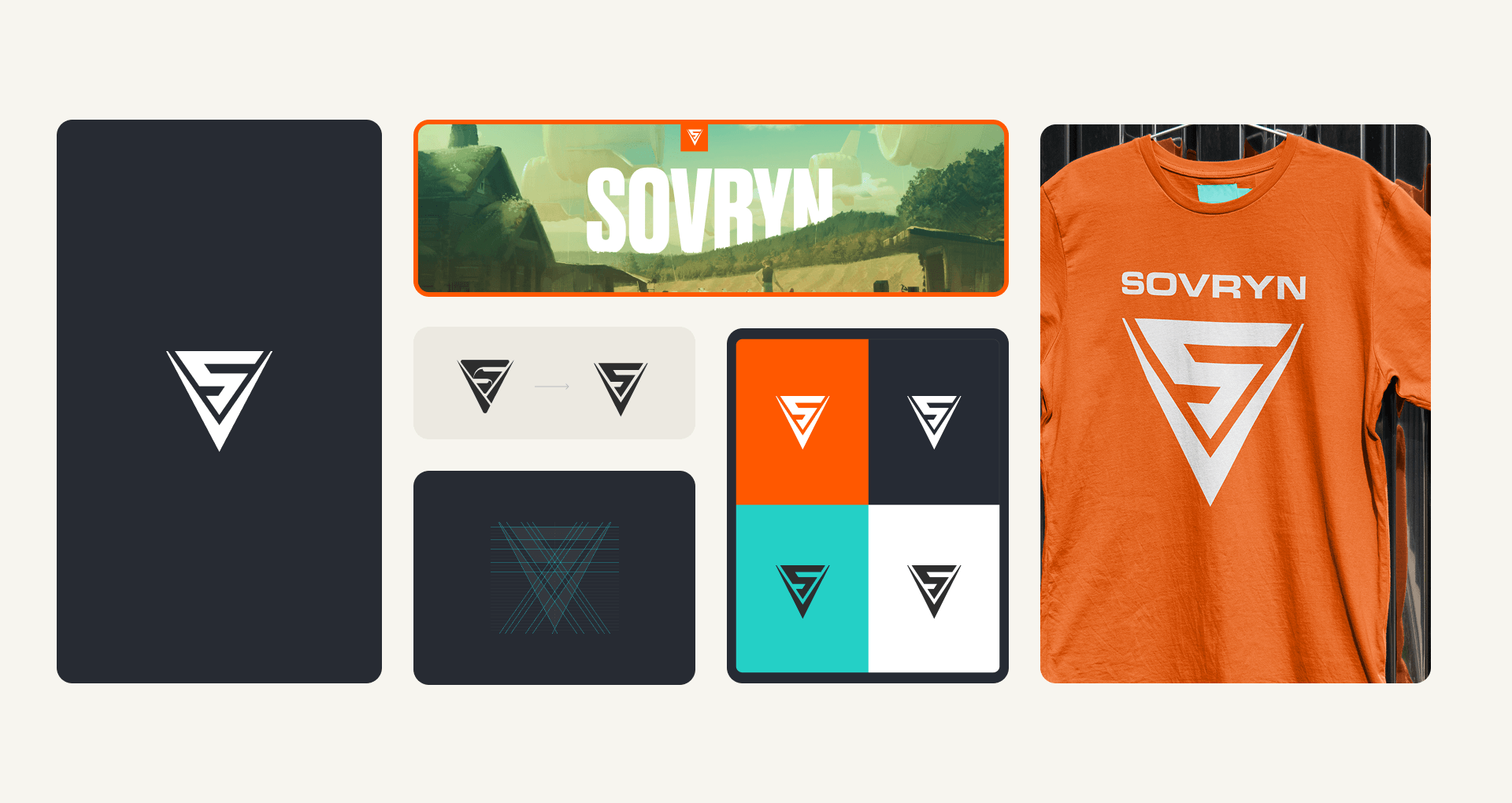
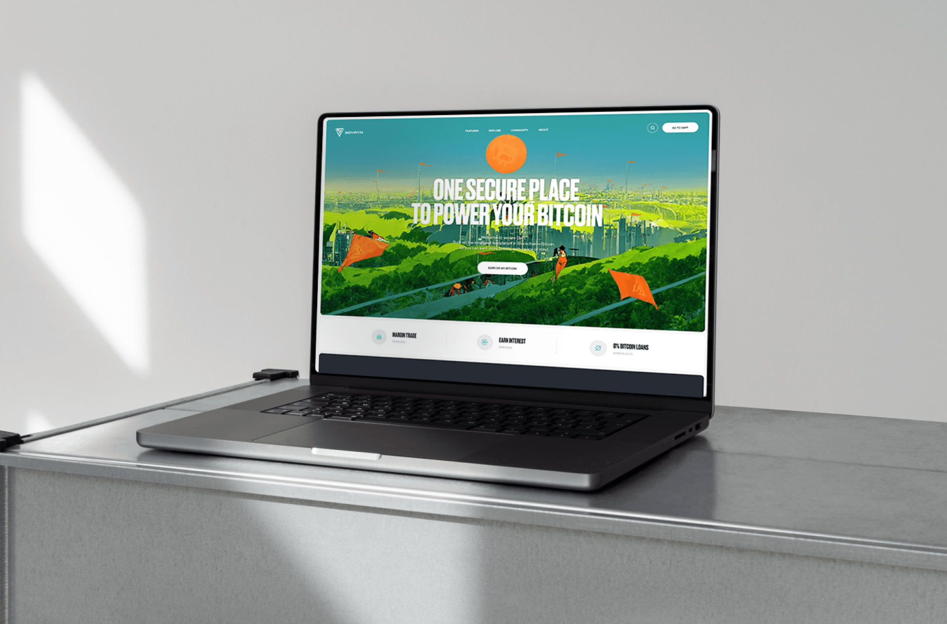
Sovryn is a decentralized exchange that underwent a global rebrand in 2023. What started as a startup had grown into something bigger – a platform with a strong philosophy and a real community behind it. It needed a brand to match.As art director and UI designer on the rebrand team, I updated the Sovryn logo to align with the new direction: cleaner, more minimal, and built to work across every digital surface.
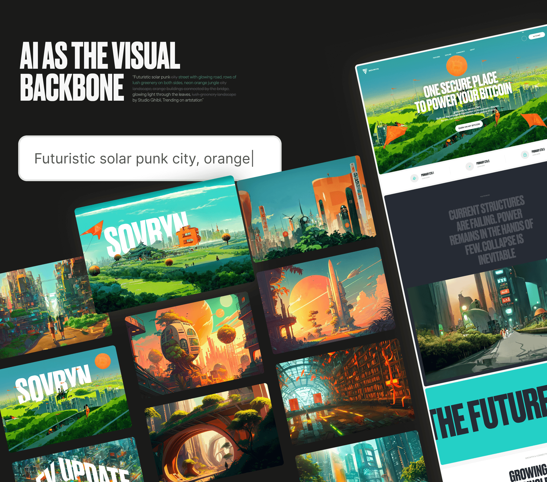
Late 2022. Midjourney had just launched, Stable Diffusion was barely out, and AI imagery was still a fringe experiment. We saw an opportunity: make it the visual backbone of Sovryn's new brand. The tools were raw and experimental — so experimental that the branding agency we partnered with refused to touch the idea. We did it anyway. AI imagery felt like a natural fit for what Sovryn stood for: cutting-edge technology, moving fast, building something new. A futuristic solarpunk city became the visual theme — optimistic, lush, and full of possibility. A better future, already being built.As art director, I developed the illustration style and created all AI visuals that launched with the new website in early 2023, becoming the face of the brand across web and social — before anyone else was doing it.
Getting a consistent style out of early AI tools was genuinely hard. There were no fine-tuning parameters, no style locks – just prompts, trial and error, and a lot of iteration. Once I cracked the formula, I turned it into a community AI prompt guide and ran a social media competition around it. The challenge became part of the brand story.
for Sovryn
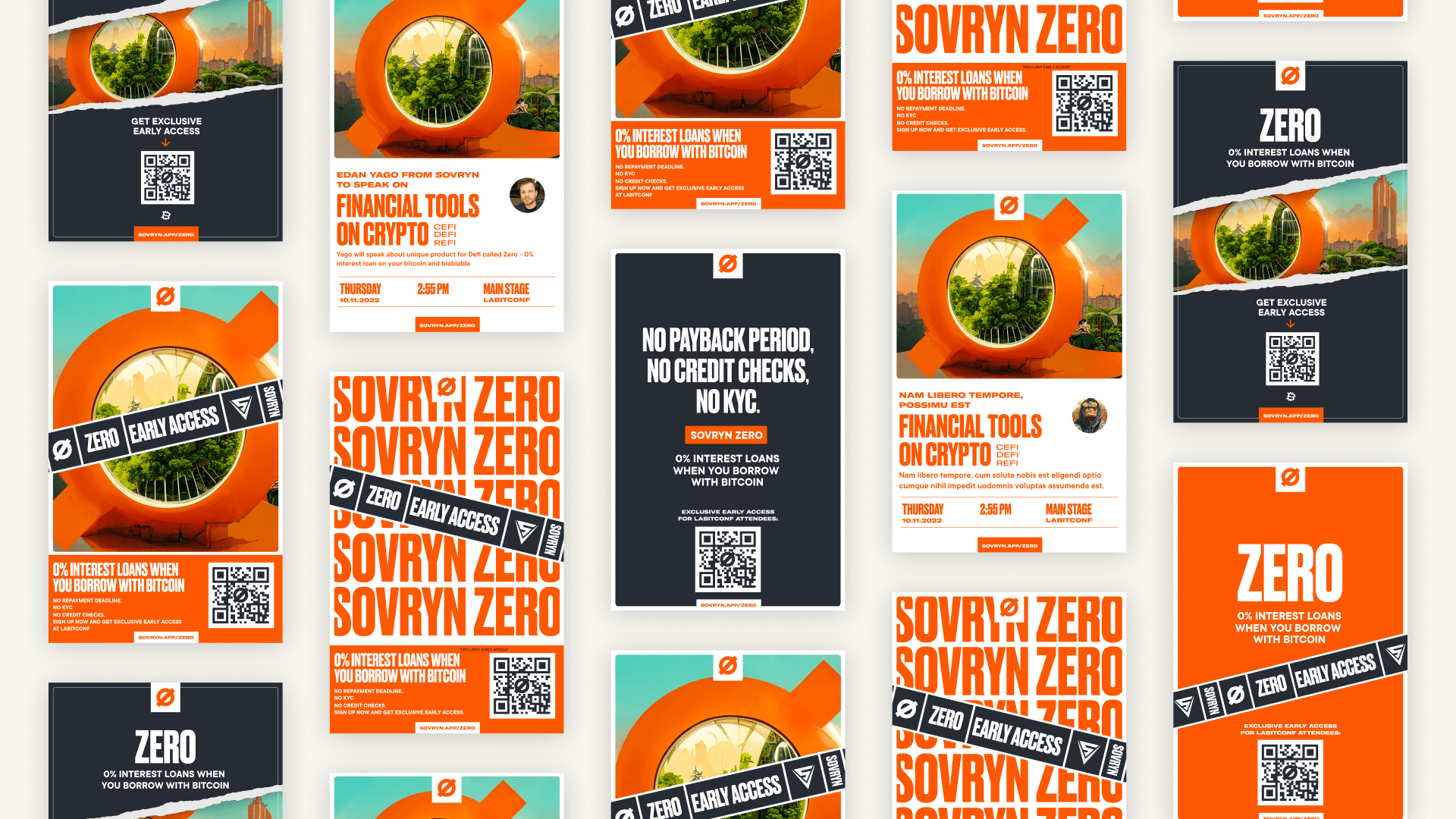
AI illustrations paired with bold typography became the brand's signature. This poster series promoted early access to Sovryn Zero — a 0% interest bitcoin loan product — across offline venues including LABitConf. Distributed with QR codes, the campaign drove direct signups and made Sovryn hard to miss on a crowded conference floor.
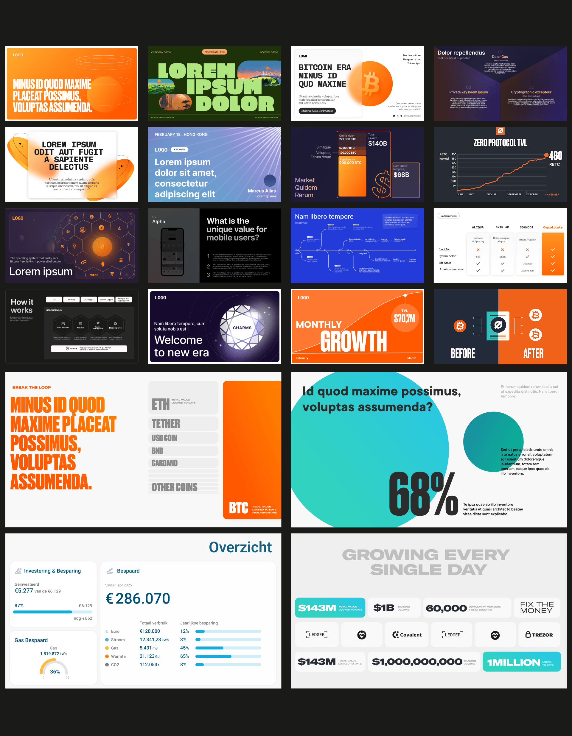
A selection of investor and conference decks designed across different projects and industries.
From slide layout and complex charts to infographics – turning dense information into something clear and easy to follow.
WCIOM
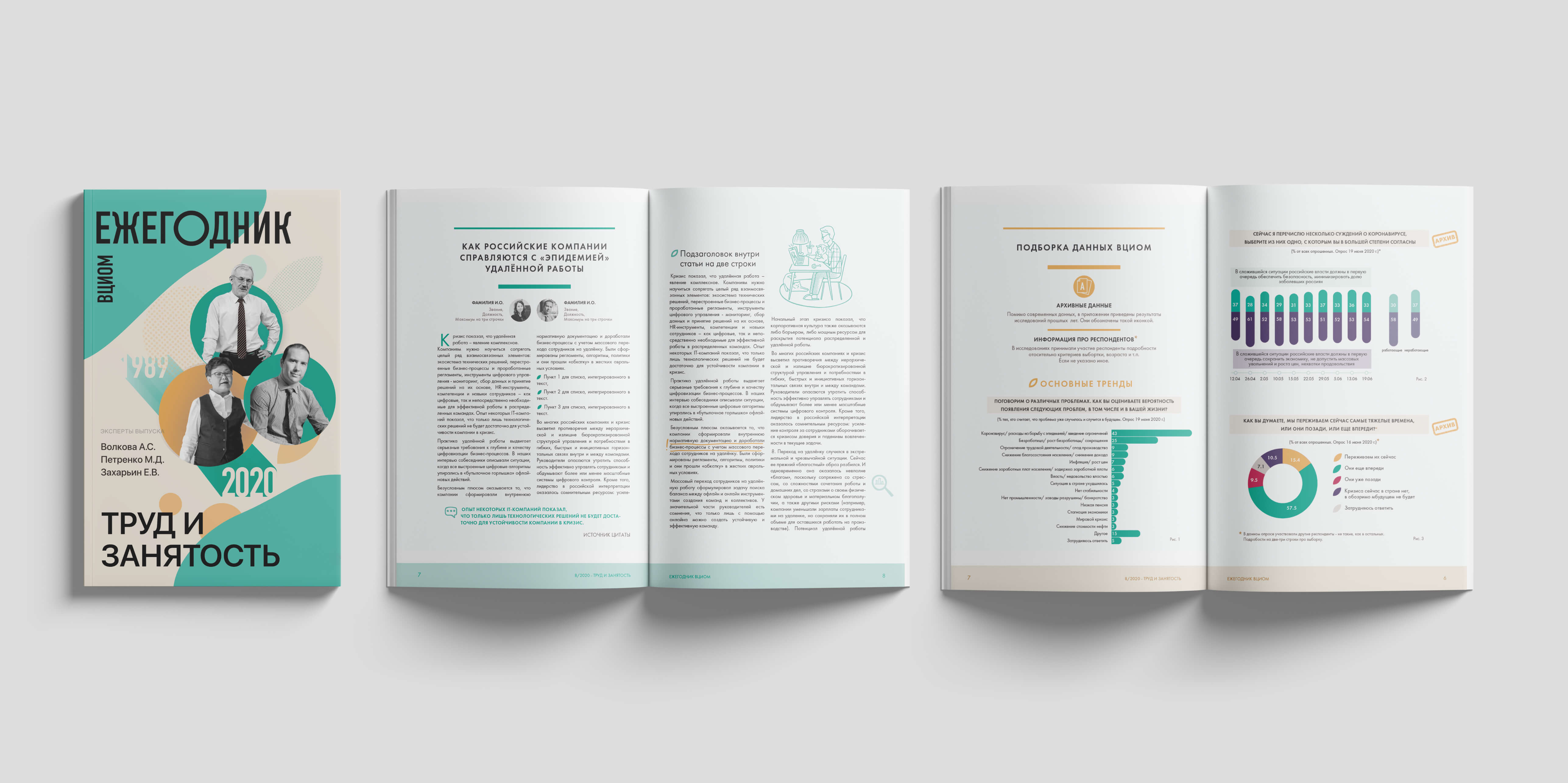
WCIOM (the Russian Public Opinion Research Center) is one of Russia's largest government analytical institutions, publishing official research on social opinion for an audience of experts, media outlets, and government bodies. They approached me wanting to make one of their periodic reports feel different — not just another dense data document, but something people would actually want to read.
The brief was open: take a format normally heavy with analytical articles, statistics, and charts across 50+ pages, and make it genuinely engaging. Working independently, I redesigned it from the ground up in InDesign — new cover, layout, type system, and a cohesive visual style for all charts and infographics. To break up the density, I added hand-drawn illustrations, marginal notes, small icons, and highlighted pull quotes throughout, giving readers small moments of visual relief while keeping them anchored in the content.
The report was well-received by the client and its audience.
Whiskey
Partnering with Jack Daniel's, I designed competition posters for Gentleman Jack and painted a hand-lettered mural for Woodford Reserve in a live bar setting. The mural was a chance to bring lettering off the screen and onto the wall — a craft I genuinely love. See mural project
.png)
Craft beer
I collaborated with Landau Beerlab to create packaging illustrations for two of their unique brews. For Szechuan flavour, I created all the label illustrations — a busy, flavour-forward scene that nods to the beer's Sichuan soup inspiration. For Galaxy Secret Double IPA, I focused on the lettering for the product name.
.png)
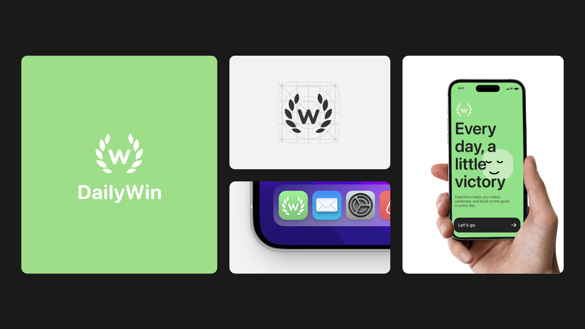
Mobile App
DailyWin is a mobile app built around celebrating small, daily achievements – a lighter alternative to the pressure of endless to-do lists. The logo needed to carry that idea visually: a laurel wreath reimagined as an app icon, clean enough to scale down to 40px and still read instantly.
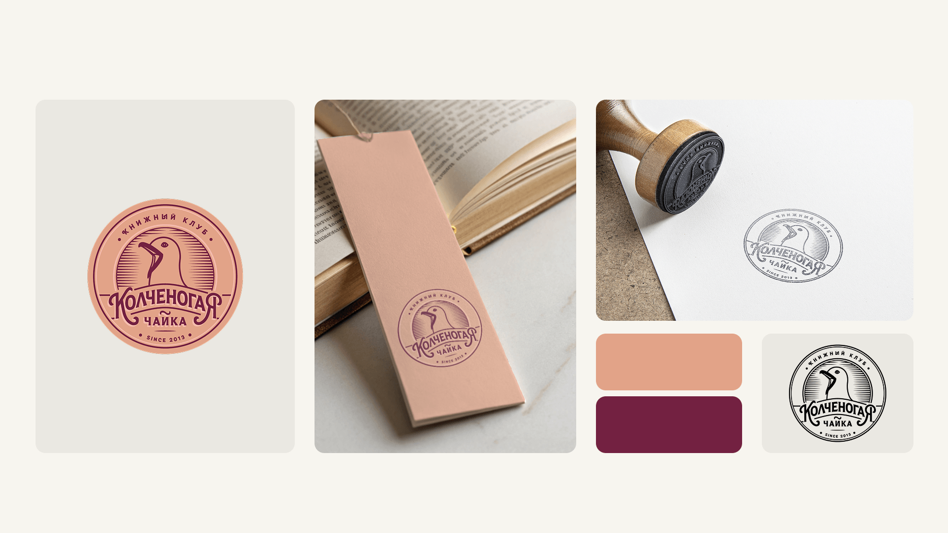
Book club
The club had a name, "Kolchenogaya Chaika" (lame-legged gull in Russian), but no visual identity. With a name like that, the bird had to be the logo. Both the gull illustration and the typeface were drawn by hand, giving it the feel of a classic novel cover – worn-in, characterful, and a little literary.
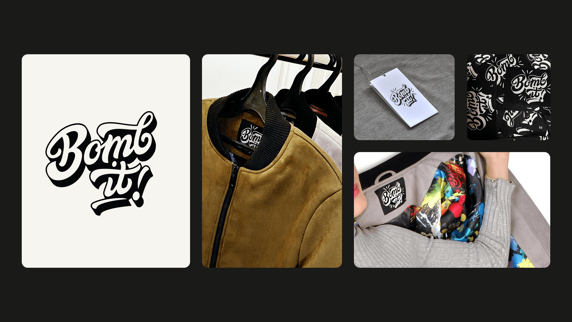
Fashion brand
Bomb It makes bomber jackets with bold, colorful prints on the inside lining. The logo needed to match that energy: hand-drawn lettering, heavy shadows, and enough attitude to work as a label and a tag.
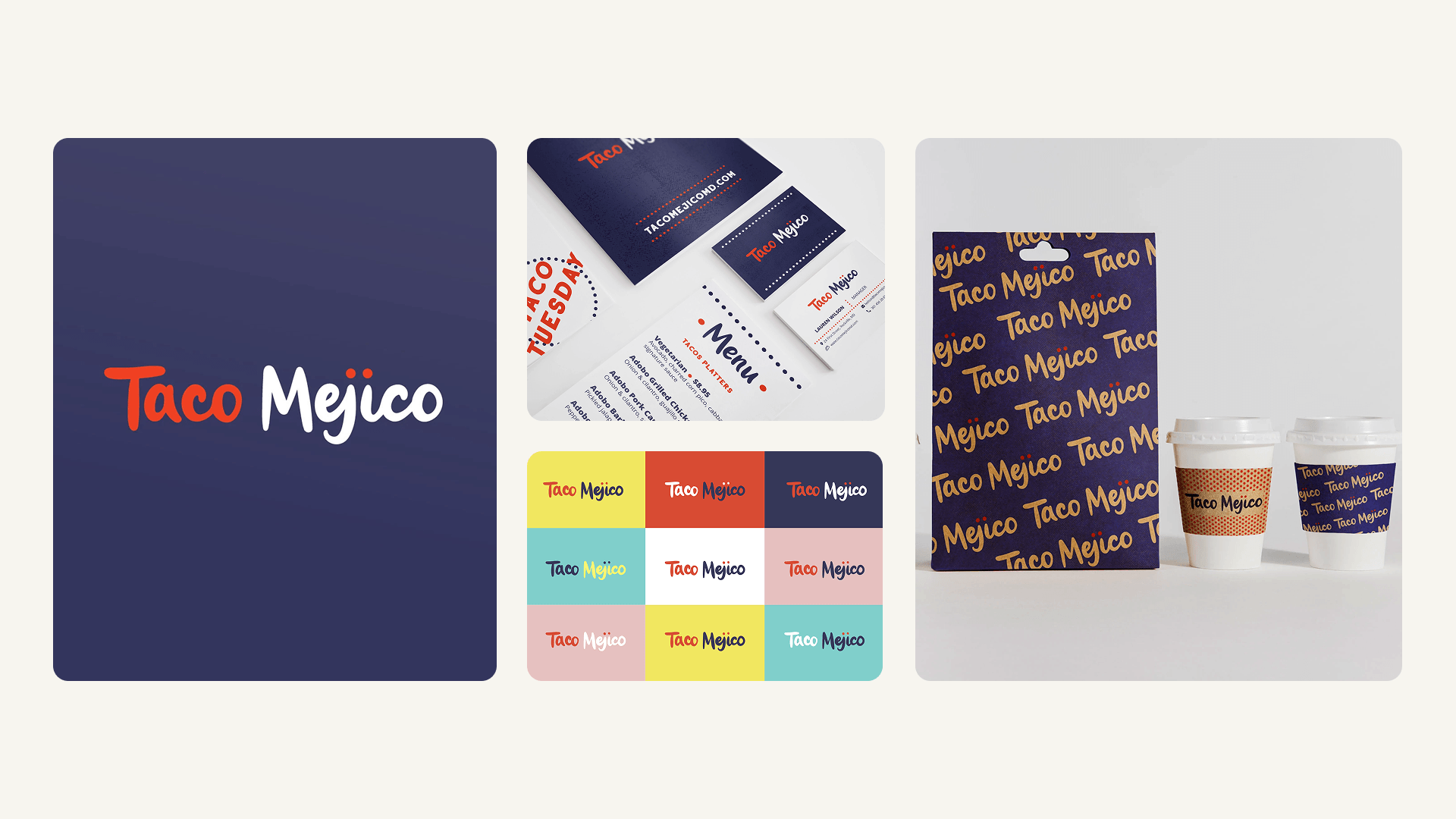
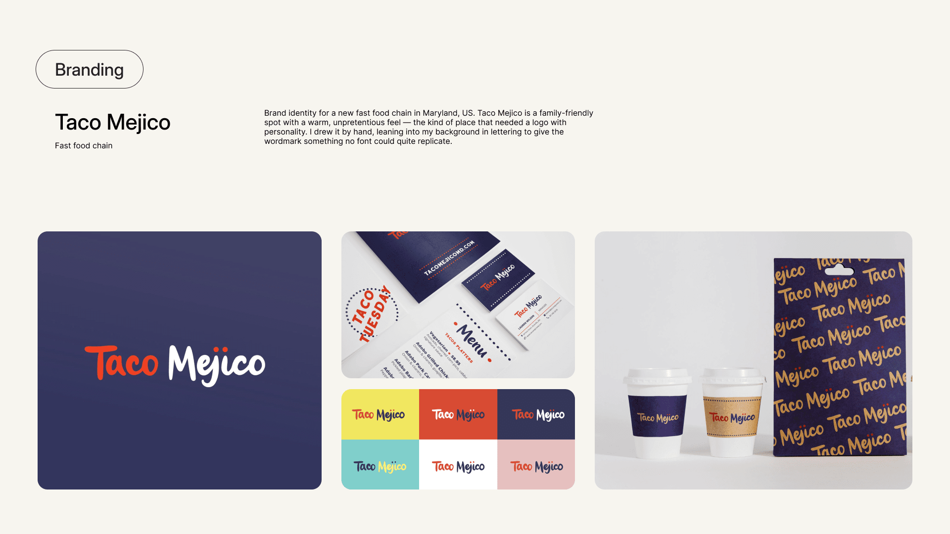
Fast food chain
Brand identity for a new fast food chain in Maryland, US. Taco Mejico is a family-friendly spot with a warm, unpretentious feel — the kind of place that needed a logo with personality. I drew it by hand, leaning into my background in lettering to give the wordmark something no font could quite replicate.

.png)
.png)
.png)